What is Google Data Studio
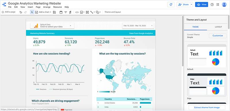
Google Data Studio is a reporting tool that allows you to easily create reporting dashboards, customize them, and share them. The reports you create with Data Studio allow your audience to benefit from the underlying data in an appealing visual format.
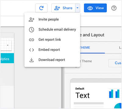
Reports can be downloaded, embedded in a website, and you also have the option to send reports to various people on a schedule (imagine, for example, sending reports to your customers).
You can track KPIs and turn your data into reports with a wide range of presentation options (charts, graphs, custom logos, colors). These reports are dynamic, meaning that if the data source is updated, then the new information automatically shows up in your report (there’s no need to recreate it). Once a report is created, you can also share it with other people and grant them permission to edit the reports.
Working on the same report with colleagues empowers your team and facilitates a better understanding of the key data of your business and makes business decisions easier to take.

Who is it designed for
Google Data Studio is designed for business analysts, sales teams, entrepreneurs. It targets mostly for people who understand the business problems but who are not very technical (don’t know how to use programming languages or write complex SQL queries but they know their way with numbers and Excel).
How much does it cost
Google Data Studio is currently free to use. However, Google might start charging for it in the future.
How to access Google Data Studio
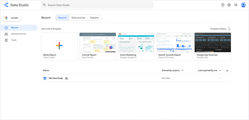
Just go to https://datastudio.google.com/, accept the terms and connect your first data source and you’re ready to start playing around with the easy visual editor.
You can add visualizations like charts, geo maps, bar charts, line graphs, scatter charts, bullet charts, area charts, etc. There are multiple ways to present your data, and you can enhance your data with images, text, or shapes.

Features
1. Connectors & Data Sources
Google Data Studio is the best tool when it comes to visualizing your Google Ads data or other Google platforms, but it is not limited to that. Data Studio has seventeen free Google connectors, like Google Ads, Sheets, Analytics, Search Console, etc. Still there are many more partner connectors that you can use for your reporting and analysis. One of those is Supermetrics that offers many connectors, like Facebook Ads, LinkedIn Ads, Custom JSON/XML, and so much more.
When you add a new data source to a GDS report, the tool lets you configure its fields by editing their type, name, or even add new calculated fields. Calculated fields are a great feature that lets you extend and transform the information flowing from your data sources and see the results in reports.
Tip: Before adding a data source to your report, there are a few things that you can set according to your needs, like:
- Data Credentials – enables users with permissions to the data set OR require users to supply their own credentials to access data.
- Data freshness – set how fresh you need your data to be.
- Community visualizations access – allow OR prevent community visualizations (created by third-party developers) from displaying data from your source.
- Field editing in reports.

2. Interactive Dashboards

An excellent report is interactive. With Data Studio, you can visually display your key business metrics. Still, more than that, it allows you to interact with data to get insightful information from your dashboards and make well-informed, data-driven, and healthy business decisions.
There are many features that you can use to make your dashboards say more than a spreadsheet could.
- Filters. In case you are working with big data, with lots of dimensions and metrics, filtering is what you need to do to understand better what you are doing well and what you are not. Data Studio lets you create chart-level, page-level, or report level filters to remove data that you don’t necessarily need. More than that, you can use filter controls to select one or more dimension values from a list by which to filter the report. For example, a filter control based on the Country dimension lets viewers limit the records displayed in charts to selected countries.
Tip: adding filter controls is not even necessary if you select the Apply filter option in the chart editing panel. For example, you included a pie chart that breaks down your website sessions by device category. Enable the option and then, in the view mode, click on a slice and watch the magic happening! It will filter the whole page by the selected device.
- Optional metrics. You can make your dashboards even more flexible by adding optional metrics. This lets you select which columns or fields to display in a specific chart.
- Drill Down/Drill Up. Drilling down is a great option that gives you a way to reveal additional levels of detail within a chart. For example, let’s suppose you want to view your website traffic by location. Some available dimensions would be Country, Region, or City. Rather than adding three separate charts, you can add a single chart with drill-down enabled.
3. Data Blending
Bring together all your marketing information by blending your data sources. Data Studio lets you blend up to five data sources, based on a join key that you will specify. Just select your sources and the fields that you want to include or simply create new fields based on the existing ones.
You can apply a filter, a date range, or, for Google Analytics sources, a segment to your joined data. This way, you can improve performance and focus on the data that is most important to you.
Tip: If you want to create a ratio metric based on two existing metrics, but they belong to different data sources, you can display them in scorecards, select both of them, right-click and Blend Data. Quick and easy!
4. Sharing Options
Data Studio has many options for sharing reports. Like other Google tools, you can get a shareable link to your dashboard and select who can view/edit it, and you can download it as PDF. More than that, you can schedule email delivery or even embed your reports.
Embedding your reports lets you integrate your data stories into a broader context. You can embed it into Google Sites, or any iframe-enabled website. You can also add your reports to social media platforms that support oEmbed, such as Reddit and Medium.

Google Data Studio is an excellent tool for reporting purposes but also for analyzing. Use it to transform your spreadsheets into beautiful, informative reports that you can customize according to your needs. The above features are just a few that the tool offers, but you can discover best what it can do only by testing it, so give it a try! Happy analyzing!

